Creating the most engaging images for social media is always tough and time-consuming! As an expert in this sector, and after lots of practice (and mistakes!), I will share with you the most important graphic design tips and principles to help improve your social media visuals.
1. Colour
In a study on the impact of colour in marketing, researchers found that up to 90% of immediate judgments made about products can be based on colour alone. Colour is one of the most important aspects of any design. It sets the mood, creates atmosphere, conveys emotions, and even evokes strong individual experiences from someone’s past!
The following example, from the brand Havaianas, clearly demonstrates the power and usage of colour in conveying personality, while reflecting positively back on the brand. Consistent to the brand identity, eye-catching vector work and the use of colour tell a story and evoke emotion.
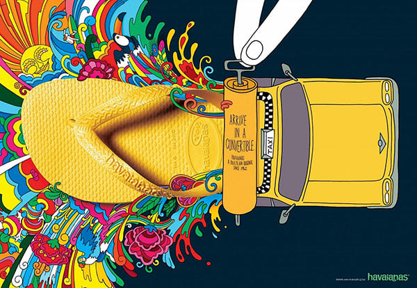
Use colours in your images that guide your audience through the story of your brand. Do so by considering the appropriate colours to help tell a specific portion of that story.
Just take a look at the principles of colour theory, how colours affect the brain, and how they’re often used in storytelling and marketing:
♦ = Energy and urgency
♦ = Aggressive
♦ = Optimistic and youthful
♦ = Wealth and relaxation
♦ = Trust and security
♦ = Romantic and feminine
♦ = Powerful and sleek
♦ = Soothing and calm
2. Balance
Balance is an art, and is tricky to get the hang of, but well worth the effort, especially in the world of social media. The best way to think of balance is to imagine that each element of your design has a “weight” to it.
It’s also important to remember that different elements carry different weights; balance does not have to be split right down the middle. There are 4 types of balance:
- Symmetrical
- Asymmetrical
- Radial
- Crystallographic
All of the above can make for eye-catchy designs. The following images demonstrate the beautiful use of symmetrical balance (left), and asymmetrical balance (right), which creates tension through contrast and can be visually interesting when done correctly:
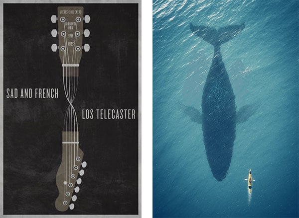
Another instance in which balance becomes important is in choosing photography images. The following image is a great example of a photo that excels by taking balance into account!

3. Lines
Straight lines imply order. Curved lines hint at movement.
Lines are the visual elements that help guide the eye where you want it to go. Straight lines give the image a sense of order and tidiness, while curved lines give the image a sense of organised tension and movement.
The correct use of lines throughout your image can help guide your audience along a visual journey, intentionally stopping at the most important elements along the way.
Take a look at this powerful example of line illustration by Muti:

The use of clean diagonal lines throughout the illustration navigates your eyes to different areas in a quick and efficient manner.
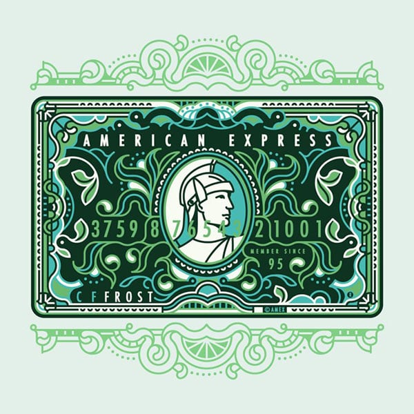
Now compare that to the curved lines of the next illustration created by the same artist. How it creates a sense of motion leading you around the graphic until you land back at the center focal point:
4. Typography
Choosing the perfect font (or set of fonts that work together) can bring your social media designs to life. It also has a big impact on how your design is received by people and, ultimately, the message your brand sends across.
The most important aspect to keep in mind when selecting which font or fonts to use in your design is readability.
Whichever font you choose, make sure that your audience can read your message. Here are a few pro-tips for using fonts
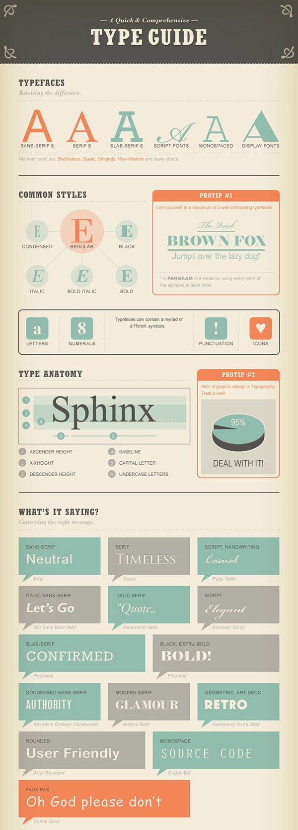
- Limit your design to a maximum of 3 typefaces
- Use font sizing that fits well within the medium that you are publishing to
- Traditionally, serif fonts are best for print and sans-serif for web
- Kerning is a great technique to use in your titles
For those who have no idea what the above bulleted list says, this infographic will help!
5. Contrast
Contrast can be achieved with colours, shapes, and sizes. Have you ever heard someone say that a design “stands out“?
What they may be referring to is the contrast in an image. Contrast adds differentiation between elements, making one stand out or “pop” more than the rest.
The use of effective contrast is a great way to enhance your designs. Without contrast, the design is at risk of being “flat.”
Here are my 3 favourite ways of adding contrast to an image, without under- or overdoing it:
- Contrast with Colours (left image)
- Contrast with Shapes (middle image)
- Contrast with Sizes (right image)

6. Hyerarchy
Place the most important elements in the biggest fonts!
The majority of graphic designers work with multiple elements in their designs. Each of those elements is important to the overall message. Hierarchy is a great social media design tip in order to make sure that you’re getting your most important message out first.
Taking full advantage of hierarchy starts with an understanding of your goals. Establish the most important message as the focal point and then use the other design principles in this article to make it stand out!
A simple example is this travel advertisement. The image draws the reader into “travel” and then leads them to the secondary messages.

7. Repetition
Always use the same set of fonts, colours, and graphic elements.
One of the easiest design elements to enhance your designs is the principle of repetition. Repetition is an important part of the process because it helps to establish and strengthen different elements.
It’s also what people often refer to as “consistent branding.”
Four things to always try and keep consistent within your designs are fonts, colours, logos and branding (graphic) elements. Over time, repetition of these four elements will give your brand a unique and instantly recognisable look.
Take a look at this Apple advertisement. The use of repetition in this image helps to create consistent association. It also does what it set out to do: give a sense of movement (through dance) in the image!

Repetition is also important when building a brand. Whether you’re a big brand or just a one-person shop, repetition helps you become recognisable over time.
References:
https://blog.bufferapp.com/53-design-terms-explained-for-marketers
http://blog.visme.co/composition-rules-for-non-designers/
https://blog.bufferapp.com/social-media-design-tips
