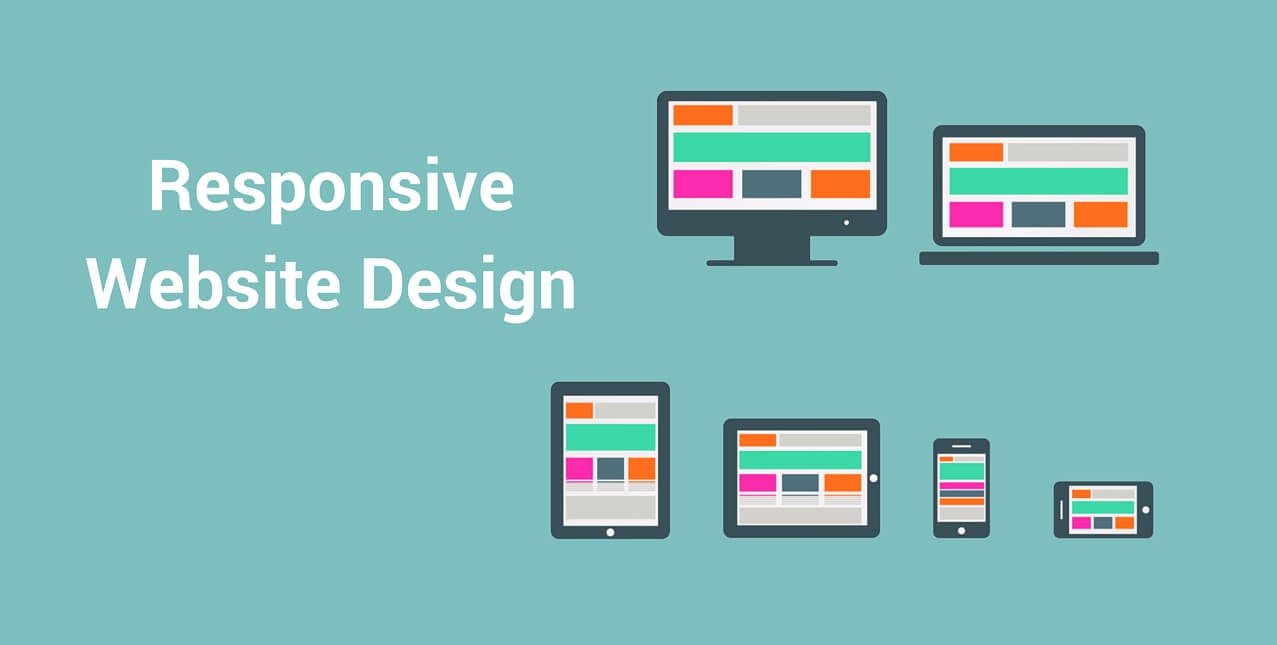
What is Responsive Website Design?
Responsive design allows the same website to adapt to the screen it's displayed on without compromising functionality or aesthetics.
In other words, it is the approach that suggests that design and development should respond to the user’s behavior and environment based on screen size, platform and orientation. The practice consists of a mix of flexible grids and layouts, images and an intelligent use of CSS media queries. A responsive website should have the technology to automatically respond to the user’s behavior.

How Does Responsive Web Design Work?
Responsive design targets the width of each user’s web browser to determine how much space is available and how it should display the website.
Breakpoints are set to allow different behaviors or target ranges within predefined dimensions on specific displays via the use of pixel widths. For example, you generally see breakpoints for phones, tablets and desktops. Responsive sites use fluid grids.
All page elements are sized by proportion, rather than pixels.
Key Features of Website Design
Unlike isolated mobile websites, responsive design adapts the layout of the whole website to the viewing environment by using fluid, proportion-based grids and flexible images. So if you have three columns, you wouldn’t say exactly how wide each should be, but rather how wide they should be in relation to the other columns. For instance Column 1 should take up half the page, column 2 should take up 30%, and column 3 should take up 20%.
Media such as images is also resized relatively. That way an image can stay within its column or relative design element.

Four Advantages of a Responsive Web Design
1.Flexibility
Responsive web design sites are fluid, meaning the content moves freely across all screen resolutions and all devices.
2.Ultimate user experience
The user experience enables visitors to consume content on any website through the device of their choice and preference. Thus; responsive web design is about providing the optimal user experience irrespective of whether they use a desktop computer, a smartphone, a tablet or a smart TV. According to Google Think Insights on mobile, if a user lands on your mobile website and is frustrated or doesn’t see what they are looking for, there’s a 61% chance they will leave immediately and go to another website (most likely a competitor). It’s also said that if they have a positive experience with your mobile website, a user is 67% more likely to buy a product or use a service.
3.Cost Effective
Responsive web design enhances SEO efforts by having all your visitors directed to a single site no matter what they prefer to use as a device.

4.Google says so
When Google speaks, search marketers listen. Google states that responsive web design is its recommended mobile configuration, and even goes so far as to refer to responsive web design as the industry best practice. Google prefers responsive web design because content that lives on one website and one URL is much easier for users to share, interact with and link to than content that lives on a separate mobile site. Google is placing on user-experience as a ranking factor, this is essential to take into account with regards to SEO.

Having a responsive website is no longer simply a nice feature. Now more than ever, it is a necessity and literally impacts the growth of your business.
If you want a responsive website or a FREE consultation on your website Contact Us. or simply check what we can do for you, here
In the mean time read our Guide about the “6 phases of creating a website”.
Food for thought:

We hope you enjoyed this article as much as we did. Do not forget to leave a comment below if you have any suggestions.
Sources:
http://codeboxr.com/blogs/top-5-advantages-of-responsive-web-page-design
http://blog.hubspot.com/marketing/responsive-web-design