Rebranding can be a challenging task. It’s like your business is undergoing a metamorphosis of sorts and it can be an experiment that you simply take a leap of faith on, without having any guarantees in terms of results and consequences. At the same time, it is a chance to shed an old identity and embrace a new vision for your brand, as well as an opportunity to stay modernised and refreshed in meeting the ever-changing needs and demands of your target audience.
Although not all stories may be a given success, each one can act as a learning experience and a testament to the importance of adaptability, taking risks, staying relevant and catching up with the times. Whether brands go through an entire rebranding process, from their logos to their brand values, or whether a company decides to expand or even minimise its intentions, every rebranding story has its meaning and a lesson to be learned from it.
Here are 8 rebranding stories and the lessons that we can take away from them.
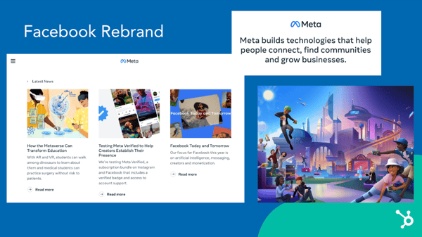
1. MetaFacebook underwent a very public, controversial and revolutionary rebranding back in October 2021, when it was renamed to Meta and clearly outlined the newest intentions of the brand, as it looked to transition beyond being associated as a mere social media platform to being redefined as a metaverse company. The rebranding came with a whole new visual appearance package with a contemporary logo design and identity as a transformative step in moving towards creating immersive and interconnected experiences by leveraging augmented and virtual reality.
Meta will aim to create a metaverse, where users will be able to seamlessly and innovatively connect and explore in a mind-blowing digital universe.

What lessons can we learn from Meta’s rebranding:
- Staying relevant in an ever-changing digital landscape by evolving along with the times and consumers’ needs
- Pursuing bold opportunities by embracing new technological & digital advancements
- Adapting to new market dynamics and being a visionary among competitors
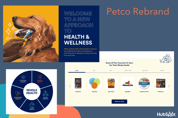
When Petco decided to move away from old-school animal training conventions and removed electric shock collars from their catalogues, the brand went beyond just being a pet supply store, and moved more towards a holistic approach to the health and wellbeing of animals. In October 2021, Petco went ahead with their rebranding with the launch of a new homepage and app that promoted pet care and quality resources in their attempt to re-establish the brand as an expert in fostering a deeper and healthier understanding of our pet’s needs.
Petco’s rebranding made sense, at a time and age where pets are treated as members of the family, and awareness of their wellbeing has been enriched to new levels by having such a devoted approach to animal wellness.

What lessons can we learn from Petco’s rebranding:
- Paying attention to customers’ lifestyle and how they can be reflected in your brand
- Holistic customer experience
- Fostering a strong loyalty to customers’ priorities can showcase more commitment and create more meaningful relationships
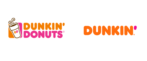
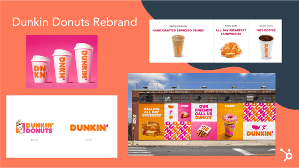
The globally famous Dunkin Donuts went for a shorter, rebranding effort back in 2019 by renaming the company to simply Dunkin’. The intention was for the brand to reflect how it was not just about donuts anymore and evolve towards catering a larger range of consumers’ demands and needs. As the brand expanded towards offering other food and beverage options, like snacks, coffee and breakfast sandwiches, it also embraced a new logo and identity transformation with a bolder and modern font that encapsulated the refreshed essence of the company.
Dunkin’ remains highly recognisable and has managed to maintain its relevance in creating lasting connections, while meeting consumers’ demands.
What lessons can we learn from Dunkin’s rebranding:
- Adaptability and relevance are great assets to maintain within a brand’s identity
- Progress with the times and do not be afraid to redefine your priorities through constant reassessment of your brand’s values and messaging
- Changing consumer preferences need to be taken into account in order to remain competitive in the market
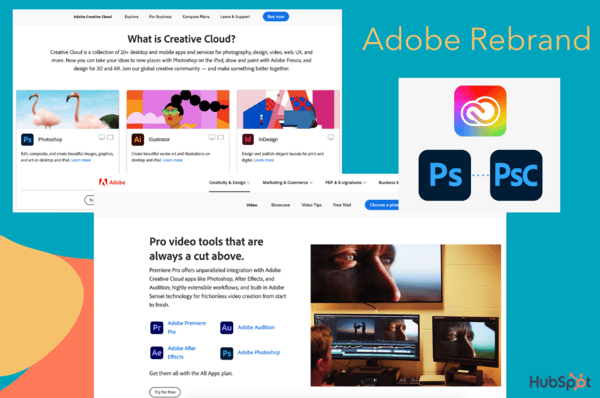
Adobe Creative Cloud was launched in May 2020, as a rebranding initiative that speaks to the true power of innovation and evolution. In an attempt to further highlight the high quality and variety of products offered to creatives around the world, a new logo with warmer hues was launched, along with a new Creative Cloud logo that embraces a colourful gradient to highlight the importance and creativity, and lastly, new product logos with 3-letter mnemonics.
The result was an organised rearrangement of the many products under Adobe Creative Cloud that became easily recognisable, navigable and opened up a whole new creative world to limitless possibilities for designers and creators.

What lessons can we learn from Adobe Creative Cloud’s rebranding:
- Fostering a culture of innovation that acts as a visionary ground-breaker
- Organisation and the continuous rethinking of how to provide consumers with a more constructive and seamless experience are key elements to maintaining success
- Prioritising customer needs by creating an ecosystem that nurtures creativity and growth
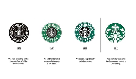
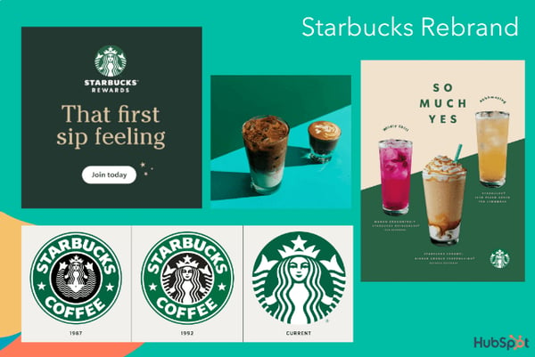
Starbucks is one of the most identifiable and valuable brands around the world and that is no coincidence. The company’s commitment to brand identity, values, community and authenticity are key elements of why it keeps resonating with global audiences and their rebranding efforts in 2020 were an added proof of their innovation. With its ‘Starbucks Creative Expression’ brand guide, the brand made an impact with its defined voice, typography and logo that prioritised consistency across all channels and locations.
By sticking to its fundamental roots, while aspiring for a more modern, slick and open approach that would nurture genuine human connections and community engagement, Starbucks proved once again why it is more than just a coffeehouse.
What lessons can we learn from Starbucks’s rebranding:
- Maintaining a recognisable brand identity that can be refreshed and refined without losing the fundamentals of your vision and values
- Creating an environment that goes beyond the products or services of your business
- Crafting a bonded, loyal and meaningful community
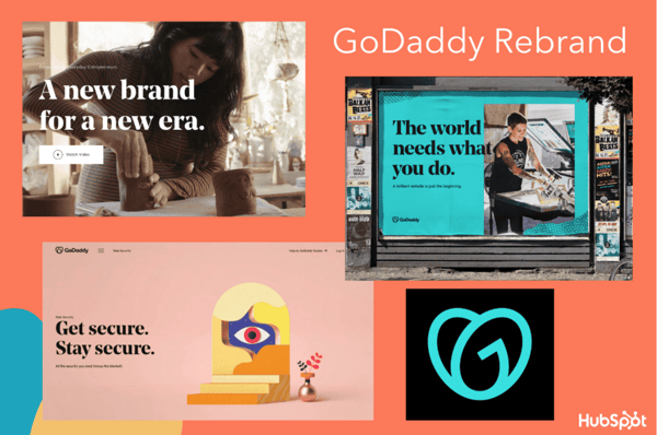
GoDaddy underwent a huge rebranding in early 2020 with a new logo, website design and marketing campaigns to help spread the word. A web hosting service that was founded back in 1977, GoDaddy was in great need for shaping a new brand identity and they went all out in ensuring that their reimagined growth would inspire, resonate and make an impact. The new logo, named the GO, is meant to represent ‘the indomitable spirit of everyday entrepreneurs’, and along with a bold, serif font, hand-drawn illustrations and colourful visuals, catapult the brand into a new, modern era.

What lessons can we learn from GoDaddy’s rebranding:
- It is never too late to refresh your brand’s identity and bring it back into the limelight
- Make an impact that will resonate with your audience and drive more consumers to trust your brand
- Undergo a makeover that will empower and fuel your future success by incorporating modern mechanisms
Pottery Barn, despite its 7 decades in the market, has seen the need for striving to achieve and promote more renewable and modern priorities and has undergone a refreshed rebranding to bring to the forefront its sustainability initiatives. The brand’s shift led to the company’s growth in meeting current consumer needs and modern progressions through a dedicated landing page that thoroughly explained its sustainability efforts and commitment. The brand was also able to recognise how it would be an incredible selling point in devoting all their endeavours to this new-found concept and how it would make customers’ purchasing decisions more easy and direct.
Pottery Barn did not shy away from going back to the drawing board and figuring out ways to implement their strategies within the realm of new realities.
What lessons can we learn from Pottery Barn’s rebranding:
- Identifying the sweet spot that will attract and appeal to consumers according to the changing needs and trends of the market
- Adapt a unique selling point that will only reinforce your brand’s values
- Provide valuable information to your audience that will entice them to follow your mission

Many rebrands, and certainly the ones we have already mentioned earlier, bring out a hint of success and a triumphant vibe as they progress towards a better, slicker and more empowering era for companies. However, that is not the case for this one.
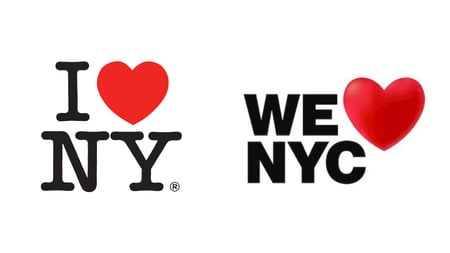
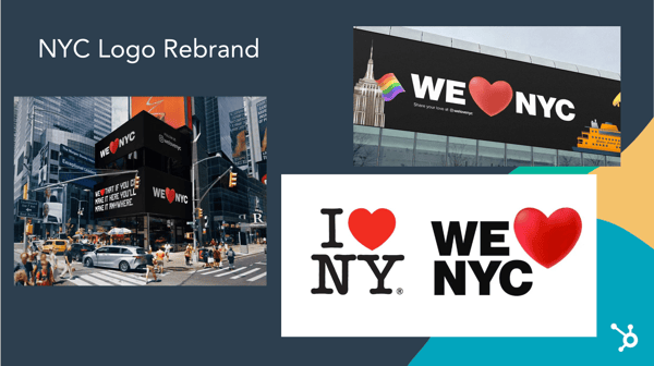
The ‘I ❤️ NY’ is nothing less than iconic. Whether people have visited New York, live in New York or simply are generally aware of the existence of New York through film and TV shows, it is a staple logo that has stood the test of time because of its simplicity. On 20th March 2023, the unthinkable happened, as a rebranding campaign was announced where the logo would become ‘We ❤️ NYC’ in a shocking unveiling. The logo’s design adopted a more modern font and more dimensional approach to the heart symbol, yet it lacks the elegance and simplicity that was captured with the original approach of the logo that we have all grown to love and admire.
What lessons can we learn from I ❤️ NY Logo’s rebranding:
- Customers feedback is crucial in making drastic changes and the audience should be the ultimate decision-maker
- Always consider existing brand equity and plan on building upon and respecting it
- Never forget your brand’s intentions - there’s beauty in simplicity and although modernising your identity is never a bad idea, there are less drastic ways to go about it
Some valuable lessons to be learned, whether a brand is looking to undergo an extreme rebranding, a smaller transition into something else or even just lessons to have in mind for everyday practices in looking to stay up to date with happenings and changing attitudes in order to stay relevant, adaptable and relatable.

