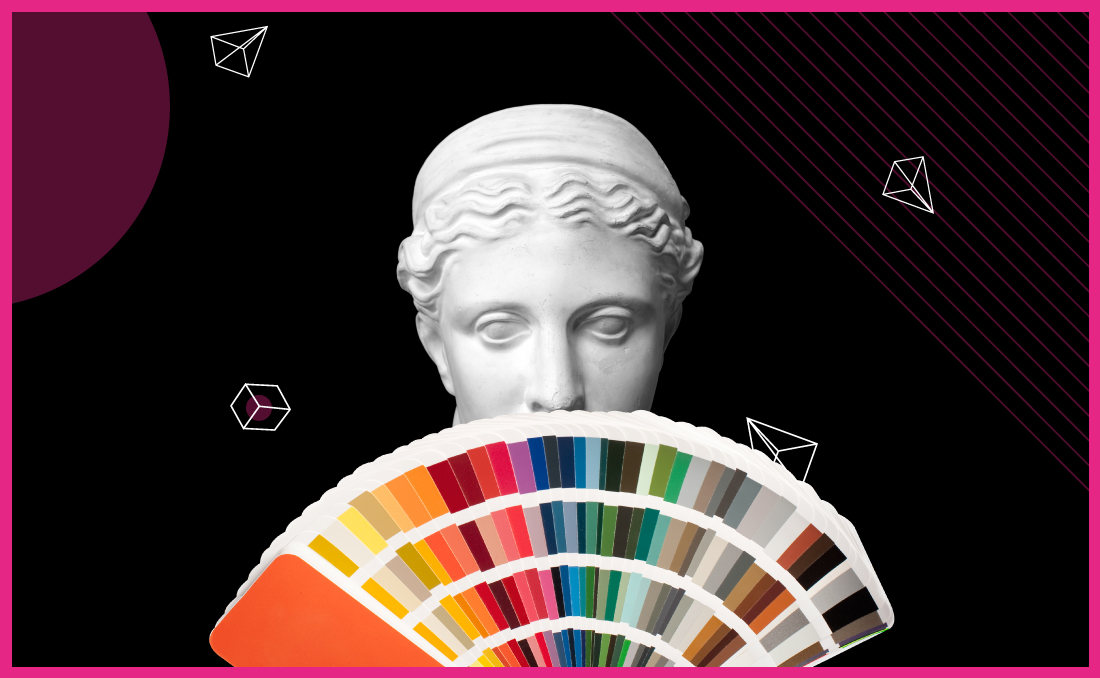
Design and colours have been messing with our psychology subconsciously over the years. All the information processed by the brain comes from sight. Visual tools can be very powerful, especially with the use of the right colours.
Why is it important?
All colours evoke emotion and feeling in different ways. By using colours strategically, you can make your audience feel a certain way about your brand. The right amount can make wonders but too much can be counterproductive. It’s important to find balance.
Now let’s find out which colour triggers which emotion, so you’ll get inspired for your next design!
BLUE
Portrays:
Stability, Harmony, Peace, Calm, Trust

RED
Portrays:
Excitement, Passion, Danger, Energy, Action

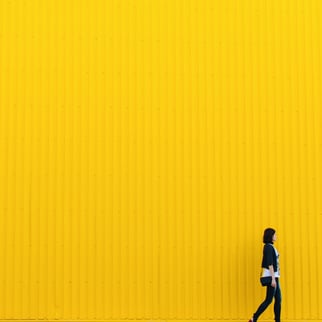
YELLOW
Portrays:
Happiness, Positivity, Optimism, Summer, Warning
GREEN
Portrays:
Growth, Fertility, Health, Generosity, Envy

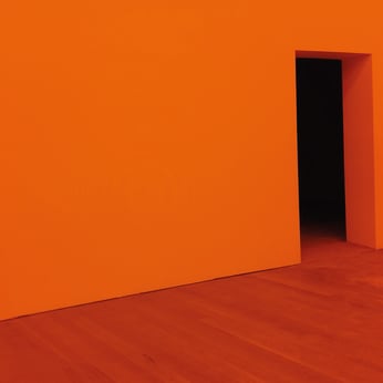
ORANGE
Portrays:
Creativity, Adventure, Enthusiasm, Success, Balance
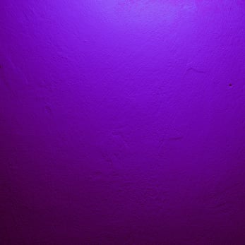
PURPLE
Portrays:
Creativity, Joy, Mystery, Innovation
BLACK
Portrays:
Mystery, Power, Elegance, Sophistication, Sadness/Anger

WHITE
Portrays:
Mystery, Power, Elegance, Sophistication, Sadness/Anger

Most designers prefer sticking to a colour scheme and use three tones for a starting point as this is enough to create variation and visual interest without being overwhelming. But it’s always down to taste!
Thanks for reading! :)